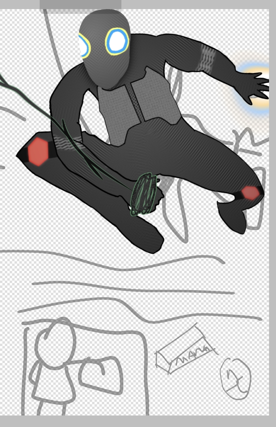
Here are the images for my magazine cover, contents page, and double page spread
Wednesday, February 21, 2024
Tuesday, February 20, 2024
Critical Self-Reflection
Wednesday, January 10, 2024
Location Scout & Risk Assesment
Location Scout
Purpose of the shoot:Risk Assesment
Sunday, November 19, 2023
Double Page Magazine Article 1st Draft
Throughout the Panels and the Pages
Big name comic book companies such as Marvel or DC have had many various and interesting storylines, and these storylines give the involved characters legacy and uniqueness everytime they are involved into them. But no other Marvel or DC storyline is as wild and remarkable as Flight-O-Man's, aka, The Repulsive Swinger's most recent storyline.
So within the most recent storyline, Flight-O-Man experiences a wild twist that shook his home society to its core. Just like your every-day superhero multiverse story, it starts off with space-and-time itself being torn to shreds, with holes to different universes leaking through it. Certainly, no other comic book storyline has started off so off-the-ground than ever.
As Flight-O-Man begins to explore the different worlds found through the wormholes, they encounter really, really monsters and enemies alike that truly tested Flight-O-Man’s patience and combat experience. Everything he experiences likes to play games on his mind as he tries to make sense and survive everything that comes his way.
But truly, what makes this storyline so unique compared to other big, flashy, action-oriented comic-book narratives, is that it shows Flight-O-Man’s development and arc as a character, resolving their own fears and self-doubts, tying up some loose ends with some problems of the past. While it may not be an entirely new concept, the idea of a superhero being just as human and just as flawed when it comes to great responsibilities with their great power was an idea that was executed very well here.
But another big highlight of the story, was the main villain - it turns out that these rips and holes through space-and-time weren’t simply an accident, but it was instead caused by Grounderth, using the time-manipulating McGuffin of the story to bend the different universes to his will. Immediately realizing his true purpose and goal from now on, Flight-O-Man immediately butt-heads with them, becoming arch-enemies. But Grounderth didn’t just clash with Flight-O-Man physically, they contrasted idealistically. The words that came out of the big bad’s mouth - it truly made Flight-O-Man think to himself… is this all worth it?
On a smaller and less existentially dreadful note, the relationships between Flight-O-Man’s allies and accomplices were also really well written. The simple, slice-of-life styled interactions between everyone really grounded and balanced the story with its already crazy cosmic complexions. Sandbob the Comedian was truly the biggest fan-favorite character for all the times they made the audience laugh, while also having an aura of mystery surrounding them.
One of the best parts of the comic book storyline that just can’t simply be forgotten is its spectacular art style. Given how wild settings the cast goes through given the context and concept of the story, the people who pen the panels certainly know how to create such dynamic visuals that show each dimensions’ distinct features, with the characters in the story just… opening their mouths, either in awe for the one-of-a-kind sights they see… or in fear for whatever eldritch monster that chases them.
Perhaps what may be some of the most discussed characteristics is how the story just LOVES to play with the heartstrings of the audience - the stakes are high as no character is safe. Without diving deep into spoilers, let’s just say getting attached to any of the main members of the casts would be a big mistake. Similar to the fellow comic book series’ before it was named Invincible, the story isn’t afraid to be blunt to the audience of the harsh realities and struggles of adventure.
As mentioned before, the story also revolves around the moral dilemma between the ideals of the protagonist and the paradigm of the villain. Is Flight-O-Man saving the day out of pure selflessness, or are they doing it for their own personal gain that comes with being a hero? The story as it goes on begins to blur even further the fine line between what is a hero and whether or not they are an anti-hero.
In the end came the final battle, the final climax of the entire journey. As always, the protagonist and the big bad have one final face off, but it unexpectedly very quickly went into such a higher stakes fight that not only shook the universe of the story’s setting, but also just shook the comic book industry on a meta level. Just like how a running racer would break a new record, ever since the final fight of this storyline happened, the entire state of the comic book industry shifted. Within the short timeframe of the aftermath of the fight, every comic book company has attempted to recapture the epicness of this fight, and while some are catching up to that finish line… there will be no other storyline with such an ending, like this one...
Friday, November 3, 2023
Terminology
This is my terminology blog
Reflection: Couldn't copy paste this as regular text, so I had to screenshot the entire terminology list. I should probably come around to memorizing some of these for the exams. Honestly the secret to correctly memorizing these, is to not just memorize them, but put them to practical use and in examples.

Thursday, November 2, 2023
Contents Page: Research & Development
This is my Contents Page's research & development blog
Reflection: Just like my double page spread, I wish I had more time to make it look better, but I am proud of whai made despite being so bare minimum.
As an importnant note, given the genre of my magazine is pretty niche & sparce, I might have to rely on other magazine genres for my research, and try to get ones that are similar enough.
Research
Despite the flashy & colorful nature of comic books, the layout is pretty simple for contents page and the colors are mainly black and white. Good if i want to put in minimal effort for a simple yet effective page, but no exactly great if I want something more flashy & colorful.I really like the simplistic modern font used here some of the effects on the typeface, like the yellow shadow. I like the added comic book covers and images, and the comic book dots on the side, and martian manhunte being on front o the text is cool. Only problem is that it's in landscape but that can b adjusted if i wanna go for this layout. Also whil i do like the minimalstic style, maybe a few other things added wouldn't hurt.
I'm gonna be honest, I don't think the font/typeface for the variety of texts here don't fit the genre at all. I like how the layout is very neat though, while also mixing the messy collection of comic books, gives it a natural vibe to it.
This one is a bit to simplistic, but i like the added characters i black and white. Wouldn't exactly be my first idea however...
I like how unlik the other contents pages, this one has mor focus on the character than the contents themselves. Sure, it defeats the whole point of a contents page, but peopl like comic books for it's characters, and havin one of the firs pages focus on that wil surely be an eye-catcher. Just needs color...
Development
This is a rough sketch of my contents page. The colored comic books will probably have simple symbols of existing superheroes. This format is based on the Two Morrows magazine format & the 3rd magazine I researched. The face next to the contents page is Beast from X-men wearing glasses.when going on to make the small comic books on the contents page, I forgot what It was for exactly, but I needed to see what colors could match and fit each other, probably for the small comic books
The circled images were images I needed to take inspiration from so that I knew how to make the curvy shape comic book pages have, for my small template I made just to copy paste to make the small mic books.
This is said template that I copy pasted, reshaped, and recolored for the small comic book.
The layers that I worked with when making them
I had to search up a classic Google Easter egg for one of the mic books, namely the Thanos snap Easter egg, so that I can trace it for the purple comic book.
This is what the page looked like when I was only like, half complete with it. I wanted to put more text and whatnot r the final one, but again, timeliness and deadlines are not very nice.
I searched this up to put in dots in my contents page title , just to try to and add some more comic book theme to it
this is what it looked liked in the end, it did not turn out as good as I wanted it to be but it's good enough.
Didn't have any screenshot for it whatsoever, but I also decided to make some extra splash text when the text and page line wasn't enough in my eyes, as it felt there was something missing
Wednesday, November 1, 2023
Double Page Spread: Research + Development
This is my Double Page Spread Research + Development blog
Reflection: I should add more research related to my actual magazine genre (comic books), but other than that, this seems fine. Maybe could've been more 'honest'/detailed with my answers and research, but as the old saying goes, of it ain't broke, don't fix it. Also, unrelated to the project itself, but I think reading the space magazine rekindled my love for space once more.
2nd reflection: I wish I had more time just to see how would my DPS would've fully turned out, maybe it would've been as cool as those flashy comic book magazines I've always liked. I should've managed my time more so that I could make my own assets. But I am kind of proud with how it turned out despite it being very bare minimum.
Before Reading | |
Magazine: | All about space |
Issue: | Issue 141 |
Publisher: | N/A |
Genre: | Space/Astronomy (if that counts as a genre) |
Images: | 5 images, most of them are just space-related content like the night sky of space, or the andromeda galaxy, etc... |
Layout | the text is light, the page number is at the bottom, No dropcaps, texts are in columns or simple paragraphs in images as their own sections, that being said... things dont seem too wordy. |
First impressions: | Seems interesting to learn the vastness of space and facts about them |
After Reading | |
Heading: | 100 Wonders of the Universe |
Subheading: | OUR COSMOS IS FULL OF AMAZING SIGHTS, FROM EXOTIC EXOPLANETS TO STUNNING PLANETS |
Author: | There are no bylines, unless you count 6 - 13 on the right. There are no photographers mentioned, unless the thing at the bottom left counts. |
Article: | Simply put, it gives us fun facts about various space related objects in the night sky and such, 13 of them to be exact. |
Mode of address: | It uses an indirect mode of address (doesnt address the audience), and its mainly formal, or is at least not informal. I think its mainly friendly. |
Pull Quote: | No there is no pull quote, unless you count the subheading |
Audience: | Space enthusiats are the psychographic, probably. Maybe science enthusiats may work too. |
Impression: | Twas interesting, it... honestly relit the spark I once had for space in general, and I appreaciate that. |
Inspiration: | Magazines can have fun facts and magazines can have very simple and not so flashy layouts sometimes, it can just be images and simple text, although in this case those technical elements were used because it fits the vibe of space and such. |
Before Reading | |
Magazine: | golfasia |
Issue: | August 2012/Issue No. 7: |
Publisher: | Golf Asia Indonesia Magazine (?) |
Genre: | Sports |
Images: | 10 |
Layout | The left page is this large image, whose size extends the the page on the right a bit, with the heading on the top right and two colums of text under the heading, and an image under said text. There is a column on the very right of the double page spread that shows all the examiners with their images and information, with there being 10 smal images for each examiner |
First impressions: | Seems interesting and short enough for my already low attention span |
After Reading | |
Heading: | Selamat Datang Dalam T es Kali Ini! |
Subheading: | Panduan mendalam untuk menemukan iron terbaik di pasaran |
Author: | I dont think there is a byline |
Article: | I think it's about a technological product namedd "Iron Better Player" |
Mode of address: | Does it address the audience directly (you, your etc). Is the writing style formal/informal, friendly/serious. |
Pull Quote: | I doubt there is any pull quote, although the heading may count as well |
Audience: | The targeted audience is most likely people who enjoy vehicle and machinery, despite being a sports magazine ironically enough, and it appeals to this psychographic by having the camera angle heavily focus on the vehicle from a high angle, and the machine/vehicle itself is shown as very shiny and fancy. |
Impression: | its alright |
Inspiration: | You can have the camera angles in images to specifically focus on a subject, so t hat the audience can understand that the only focus is whatever subject or product you are focusing on. |
Here is an already existing analysis for a comic book magazine double page spread.
I like how unlike most of the other double page spreads, this one uniquely uses circles for their images.
since comic book magazines aren't very common/their double page spreads were sparce to research, I had to also use the next best / most similar thing to comic books; japanese manga. The text layout in this double page spread is very... Bizzare (fitting for the series being talked about) But i do like how they put the characters and the creator himself in the magazine, and the jojojojojojojo in the background is an interesting touch.
I like the blocking technique used for Madoka & homura (the goth and pink girls on the left). Gives a sense of the dynamic between the two from just a first look
A bit too simplistic
While nothing too special, I like the background and the used image layout
my favorite out of all those in the research, it's v flashy and colorful, just like how a comic book is supposed to be, and the various Pokémon characters seemingly interacting with the comic book itself makes it fun to look at. Only problem is that there may be too much in one page to look at.
interesting color scheme and direct mode of address through extreme close up of eyes looking at the audince
simplistic once again, but interesting drawing
Development
Final Piece
Final Promotional Video
This is the blog that includes the final video, the digipak album's cover, back cover, and insides, and the social media page (there wi...

-
This is the blog that includes the final video, the digipak album's cover, back cover, and insides, and the social media page (there wi...
-
Here is what I learnt during class and was assigned to complete this classwork - Completed by Kaka & Jaden Names: Jaden, Kaka Celebrity:...
-
This is an individual-worked blog about how each of us differently learn about camera angles/movements, mise-en-scene, sound, and edit Camer...