This is my Contents Page's research & development blog
Reflection: Just like my double page spread, I wish I had more time to make it look better, but I am proud of whai made despite being so bare minimum.
As an importnant note, given the genre of my magazine is pretty niche & sparce, I might have to rely on other magazine genres for my research, and try to get ones that are similar enough.
Research
Despite the flashy & colorful nature of comic books, the layout is pretty simple for contents page and the colors are mainly black and white. Good if i want to put in minimal effort for a simple yet effective page, but no exactly great if I want something more flashy & colorful.I really like the simplistic modern font used here some of the effects on the typeface, like the yellow shadow. I like the added comic book covers and images, and the comic book dots on the side, and martian manhunte being on front o the text is cool. Only problem is that it's in landscape but that can b adjusted if i wanna go for this layout. Also whil i do like the minimalstic style, maybe a few other things added wouldn't hurt.
I'm gonna be honest, I don't think the font/typeface for the variety of texts here don't fit the genre at all. I like how the layout is very neat though, while also mixing the messy collection of comic books, gives it a natural vibe to it.
This one is a bit to simplistic, but i like the added characters i black and white. Wouldn't exactly be my first idea however...
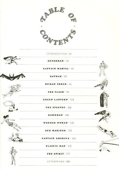
I like how unlik the other contents pages, this one has mor focus on the character than the contents themselves. Sure, it defeats the whole point of a contents page, but peopl like comic books for it's characters, and havin one of the firs pages focus on that wil surely be an eye-catcher. Just needs color...
Development
This is a rough sketch of my contents page. The colored comic books will probably have simple symbols of existing superheroes. This format is based on the Two Morrows magazine format & the 3rd magazine I researched. The face next to the contents page is Beast from X-men wearing glasses.when going on to make the small comic books on the contents page, I forgot what It was for exactly, but I needed to see what colors could match and fit each other, probably for the small comic books
The circled images were images I needed to take inspiration from so that I knew how to make the curvy shape comic book pages have, for my small template I made just to copy paste to make the small mic books.
This is said template that I copy pasted, reshaped, and recolored for the small comic book.
The layers that I worked with when making them
I had to search up a classic Google Easter egg for one of the mic books, namely the Thanos snap Easter egg, so that I can trace it for the purple comic book.
This is what the page looked like when I was only like, half complete with it. I wanted to put more text and whatnot r the final one, but again, timeliness and deadlines are not very nice.
I searched this up to put in dots in my contents page title , just to try to and add some more comic book theme to it
this is what it looked liked in the end, it did not turn out as good as I wanted it to be but it's good enough.
Didn't have any screenshot for it whatsoever, but I also decided to make some extra splash text when the text and page line wasn't enough in my eyes, as it felt there was something missing
and after making up and typing some text, here is the final product:


No comments:
Post a Comment